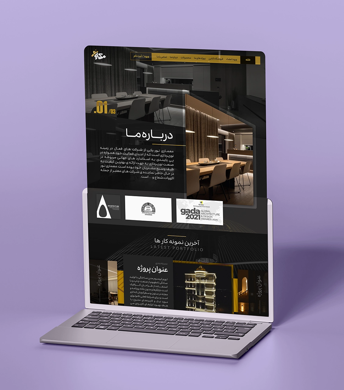
Noor Architectural Group
This website is designed to reflect the expertise, precision, and innovation that Noor Architectural Group exudes, offering a refined experience online. Every design element is crafted to match perfectly with the firm's architectural identity while at the same time being assuredly catchily beautiful and easily usable.
Key Design Features:
- Colour Palette: This colour scheme symbolises strength, quality, and refinement, exuding exclusivity and sophistication, befitting the craftsmanship and precision of an architectural design.
- High Contrast for Clarity: A thoughtfully balanced contrast enhances readability, allowing showcases of projects and service details to become striking and accessible.
- High Contrast for Clarity: High Contrast for Clarity: Geometric shapes, clean lines, and structured layouts emulate the very basics of architecture, which further strengthen professionalism and attention to detail.
- Angular Frames for a Dynamic Aesthetic: Sharp, structured angles introduce modernity and precision, reflecting the firm's commitment to innovation and artful craftsmanship.
By blending luxury with functionality, this website displays Noor Architectural Group's portfolio in style while ensuring a user experience that is engaging and smooth.