Diba Beauty Clinic
With its creative and professional design, the brochure introducing the acupuncture services at Diba Beauty Clinic effectively conveys the brand's message to its audience and creates an engaging and user-friendly experience.
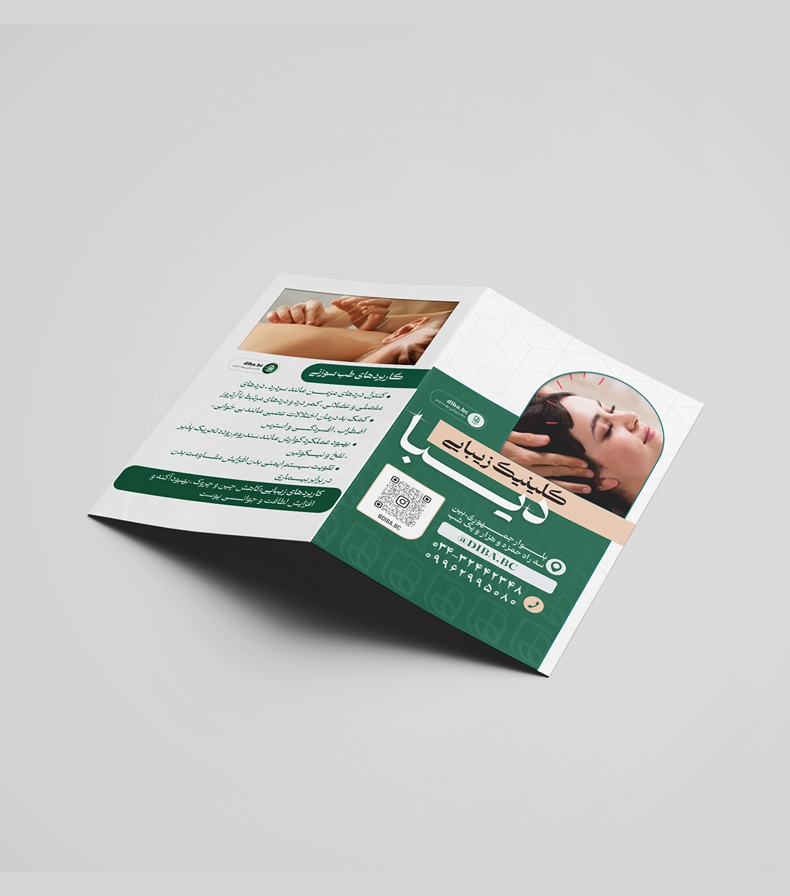
Design Features:
- Colour Palette: The Green in this brochure symbolizes health and tranquillity, reflecting Diba Beauty Clinic's identity and being the brand's corporate colour.
- Effective Use of White Space: The white space in the design is strategically used to draw the audience's attention to the more important sections while preventing visual clutter.
- High-Quality, Relevant Images: The selected images are relevant to the brochure's theme, enhancing the message delivery.
- Organized and Professional Layout: The brochure's layout is designed to display information clearly and systematically. This makes it easier for the audience to review the various services and find the necessary information.
- Call to Action (CTA): QR codes and other visual prompts encourage the audience to take actions such as contacting or visiting the clinic. The design of these elements captures attention and motivates the audience to follow through with the necessary steps.
The brochure designed for Diba Beauty Clinic effectively introduces acupuncture services and provides an enjoyable and professional experience for its audience. The clever use of colours, images, and layout makes this brochure an effective and attractive tool that successfully communicates the brand's message.