Modire Modern
This brochure is designed to present the individual's personal brand in a polished, professional, and trustworthy manner, establishing a strong and sincere connection with the audience.
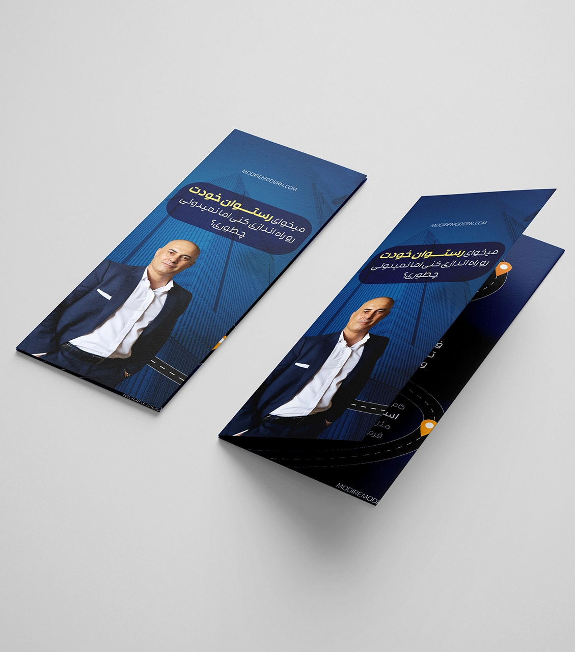
Key Design Features:
- Colour Palette: Navy blue anchors this design, chosen carefully to convey professionalism, stability, and expertise. The serious colour complements the organization's corporate branding. It reflects the personal brand's trustworthiness and expertise in restaurant management training.
- Personal Image: Including a personal photo on the front page humanizes the design and establishes an immediate connection with the audience. This approachable touch builds trust and authenticity in the personal brand, making the individual more relatable and credible.
- Simple and Focused Design: This minimalistic layout ensures the brochure focuses on what is essential. The clean design effectively shows specialized training and offerings, and your content is clear and impactful.
- Organized and Readable Layout: The text is placed thoughtfully to ensure everything is clear and easily readable, with enough spacing around images and design elements. This layout clarifies the key information regarding the personal brand's educational services and core values.
- White Space in Graphic Design: Though the site is artistically designed, great attention is given to white space. This balance provides a clean, uncluttered layout that allows users to enjoy the site's content without feeling overwhelmed.
This brochure effectively conveys professionalism, reliability, and expertise by combining a personal image, trustworthy colors, and a streamlined design. It successfully communicates the individual's personal brand in a way that resonates with the audience, fostering trust and encouraging engagement.