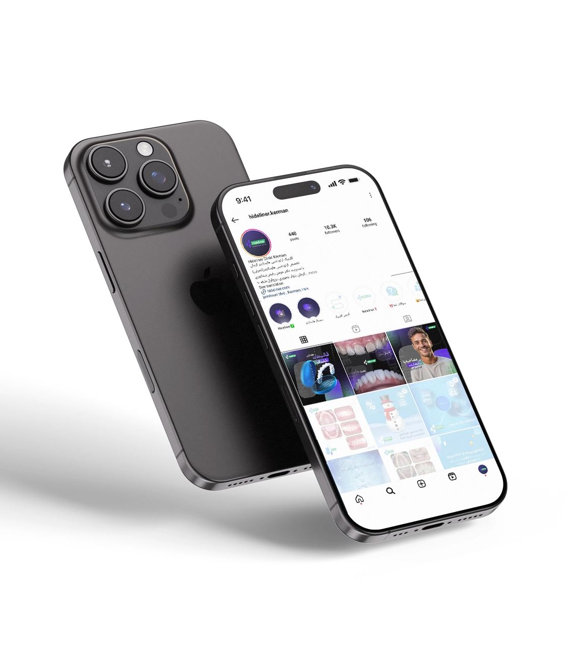
Hideliner Orthodontic Clinic
- Colour palette: The dominant colours of dark blue, white, and light teal are cleverly used in the design to create a sense of trust and calmness in the audience. This colour combination not only aligns with the clinic's brand identity but also effectively conveys a professional and modern feel.
- Fonts and Typography: Simple, modern, and readable fonts are used, conveying a friendly tone while effectively delivering educational and informative messages to the audience.
- Coordination with Stories and Highlights: The template design is structured in a way that it integrates seamlessly with stories and highlights. This coordination ensures that the brand is consistently presented in all sections, providing a smooth and uninterrupted user experience for the audience.
- Use of Videos and Personal Content: Videos of doctors and clinic staff, which effectively help build a closer connection with the audience, build trust. These videos and images of the clinic’s real services will have a significant impact on attracting new clients and make the brand appear more human and trustworthy.
- Use of Relevant Elements: Design elements such as images of teeth and orthodontic tools directly strengthen the brand identity and clarify the clinic’s services. These details help the audience become more familiar with the clinic's area of expertise and increase their trust.
This design, taking all technical details into account, simultaneously fosters trust, appeal, and professionalism on the Hideliner Orthodontic Clinic page, creating a user-friendly and human-centered experience.