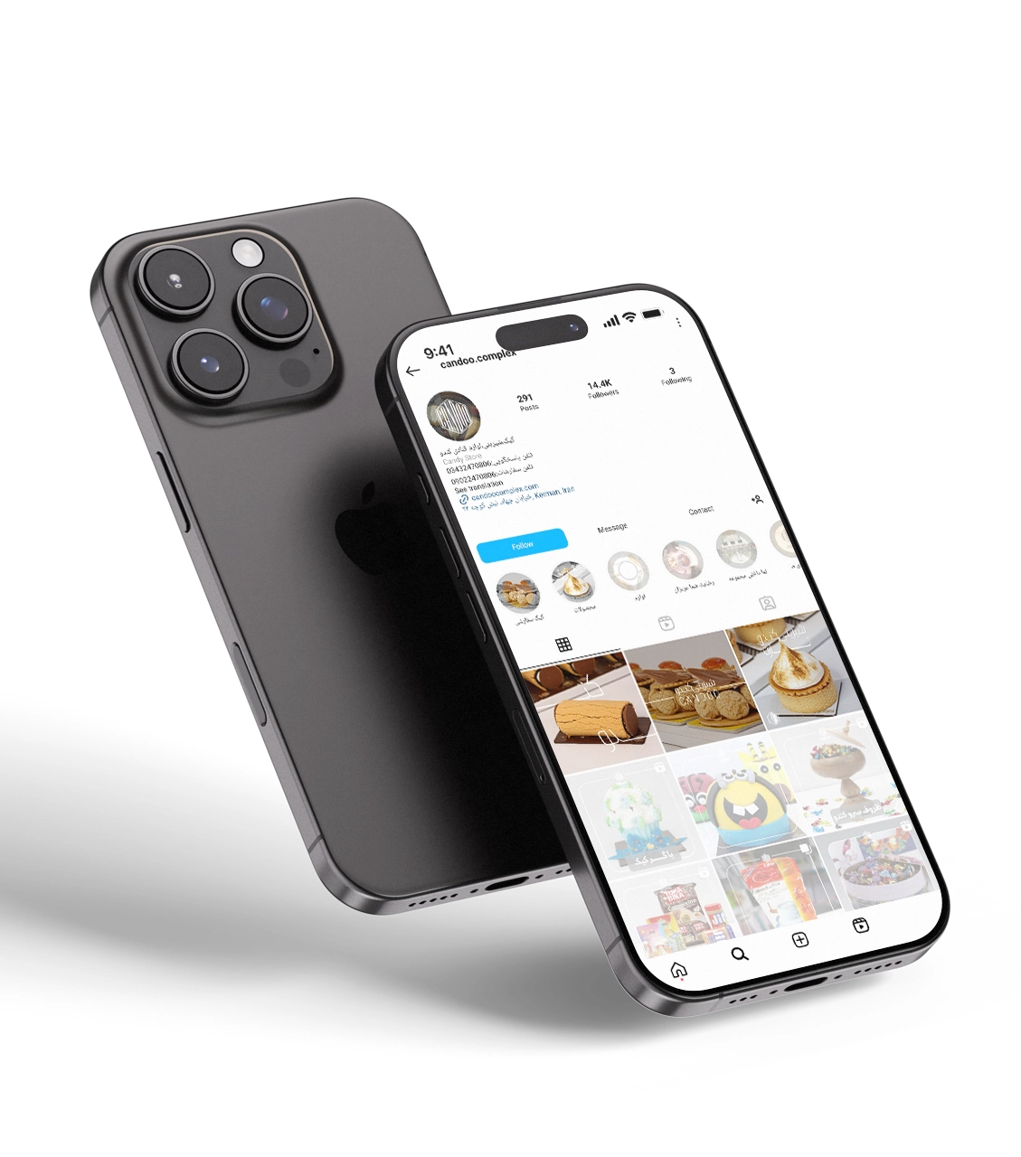
Candoo Confectionery
- Colour palette: The page's design uses warm and natural tones in the images, especially in the lighting effects, to convey a sense of warmth and calmness to the audience. These colors naturally align with the brand identity of Candoo, which in English means hive and honey. They evoke feelings of nature, honey, and beehives, which adds authenticity and sweetness to the brand.
- Fonts and Typography: Simple and minimalist fonts strongly emphasize readability and complement the images and delicate designs. This typography delivers a chic and friendly message to the audience, providing a comfortable and pleasant experience.
- Coordination with Stories and Highlights: The template design fully coordinates with stories and highlights. This coordination ensures the brand is consistently represented in all sections and aligned with its core identity, creating a seamless and enjoyable user experience.
- Use of Photos and Minimal Edits: Images of the cakes and sweets from the collection are presented with minimal and subtle edits, highlighting each product's details and enhancing their appeal. This simple and attractive design conveys a sense of freshness and authenticity to the audience.
This design combines natural colors, chic typography, and minimalist imagery to create a user-friendly experience that aligns with Candoo and Honey's brand identity.